Plotly has become immensely popular in the Charting world. It boasts of 50M+ users, 59K GitHub Stars for all Plotly projects put together, 10M+ monthly downloads and $30M in funding.
Started by Jack, Chris, Mathew and Alex in 2013 and 2014, with headquarters in Montreal, it first released Plotly.py. In 2015 they released their core technology Plotly.js as an open source under the MIT license. They started PLOTCON, a data visualization conference in NYC in 2016. They launched Dash 1.0.0 in 2017 and Dash for R and Plotly.express in 2019. In 2020 they released Dash Enterprise in Azure Marketplace, introduced integrations with Databricks and Snowflake and Dash for Julia.
That is quite a journey for Plotly.
UNDERSTANDING THE ECOSYSTEM
Plotly.js
The core of all the plotly products is a java script library called plotly.js which was open sourced in 2015. This is built on top of d3.js (another javascript library for producing dynamic interactive data visualisations in web browsers) and stack.gl (an open software ecosystem for WebGL, built on top of browserify and npm).
Plotly.js is a high level declarative charting library. It ships with over 40 chart types, including scientific charts, 3D graphs, statistical charts, SVG maps, financial charts, and more. These charts are described declaratively as JSON Objects. Every attribute like color, grids, data has a respective JSON Object. All 3D charts in Plotly.js are rendered with WebGL, leveraging the power of GPU for the fast interactivity.
Different elements used in charting with Plotly are:
- Layout which helps configure overall title, size of the chart etc.
- Data is a collection of traces.
- Traces is one plot on a chart. It further has following important elements
- type - this represents the type of chart to be drawn like scatter, bar, pie, heatmap etc
- name - this is the name of the trace
- showlegend - to control showing of the legend
- mode - determines the drawing mode for the trace like marker, text, lines, lines+marker etc
- x - provide values for the x axis
- y - provide values for the y axis
- marker - for providing colors for lines
Source code can be accessed at GitHub
Examples of Charts using Plotly.js can be seen here
Reference documentation can be access here
Plotly React
It is very easy to use Plotly in React. There is a plotly-react npm package that you can use to plot charts using Plotly in your React powered web applications. It provides a component called Plot that takes the chart type, data, and styling as Plotly JSON in its data and layout props, then draws the chart using Plotly.js
Let us look at a React code example.
You will need to install react-plotly.js and plotly.js using npm.
$ npm install react-plotly.js plotly.js
You can then create a Component using Plot and provide chart information as below
import "./styles.css";
import React from "react";
import Plot from "react-plotly.js";
class App extends React.Component {
render() {
return (
<Plot
data={[
{
type: "scatter",
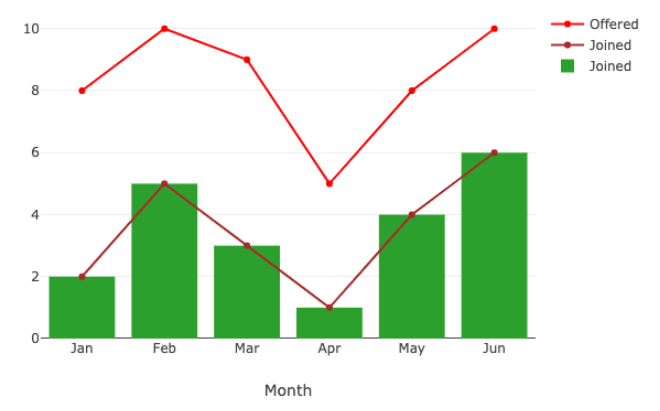
x: ["Jan", "Feb", "Mar", "Apr", "May", "Jun"],
y: [8, 10, 9, 5, 8, 10],
mode: "lines+markers",
marker: { color: "red" },
name: "Offered"
},
{
type: "scatter",
x: ["Jan", "Feb", "Mar", "Apr", "May", "Jun"],
y: [2, 5, 3, 1, 4, 6],
mode: "lines+markers",
marker: { color: "brown" },
name: "Joined"
},
{
type: "bar",
x: ["Jan", "Feb", "Mar", "Apr", "May", "Jun"],
y: [2, 5, 3, 1, 4, 6],
name: "Joined"
}
]}
layout={{
width: 640,
height: 480,
title: "Month wise hiring",
xaxis: {
title: "Month"
}
}}
/>
);
}
}
export default App;
The output of this above example is as below: Month Wise Hiring
Plotly Python
Often called Plotly.py is a python library for Plotly. This is built on top of the Plotly javascript library plotly.js. It is an open source plotting library that supports various chart types covering a wide range of statistical, financial, geographic, scientific and 3-dimensional use-cases. These can be used to display in Jupyter notebooks, saved to HTML files, or served as part of pure Python-built web applications using Dash. It has a deep integration with Kaleido image export utility and also provides support for non-web contexts including desktop editors (example Spyder, PyCharm) and static document publishing example exporting to PDF.
There are three main modules in Plotly package:
- plotly.plotly - This is the interface between the local machine and Plotly. It contains functions that require a response from Plotly's server.
- plotly.graph.objects - This contains the objects that are responsible for creating the plots (like - Figure, layout, data) and the definition of the plots like scatter plot, line plot.
- Figure is an important object in this module. It is represented as a tree where root node has three top layer attributes - data, layout and frames. This object is serialized as JSON and then passed to plotly.js
- plotly.tools - This contains various tools in the form of functions that can enhance the Plotly experience.
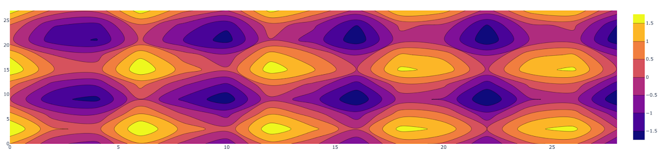
Here is an example of plotting a Contour plot also called level plot. It is often used to do multivariate analysis and visualising of 3-D plots in 2-D space. Here if we take X and Y as our variables to plot then the Z will be plotted as slices on the X-Y plane itself. This can be used in cases where you have changes in some value Z as a function with respect to the two values (X,Y).
You can use below python code in say Jupyter notebook to visualize a Contour plot using Plotly.py
import plotly.graph_objects as go
import numpy as np

# Creating the X, Y value that will
# change the values of Z as a function

feature_x = np.arange(0, 30, 2)
feature_y = np.arange(0, 30, 3)

# Creating 2-D grid of features
[X, Y] = np.meshgrid(feature_x, feature_y)
Z = np.cos(X) + np.sin(Y/2)

# plotting the figure
fig = go.Figure(data =
	go.Contour(x = feature_x, y = feature_y, z = Z))
fig.show()
Here is the output you will get when you run the above in Jupyter notebook: Contour Plot
Others in Plotly ecosystem
Plotly has become so popular that there are so many libraries from Plotly built on top of plotly.js.
-
Plotly R - This is Plotly's R package graphing library. Read more about this here.
-
Plotly ggplot2 - Another Plotly's R package that serializes ggplot2 figures into Plotly's universal graph JSON to then visualize using Plotly.js. Read more about this here
-
Plotly Julia - This is Plotly's Julia library. Read more about this here.
-
Plotly MATLAB - This is Plotly's MATLAB package that helps data and graphs as HTML files to your working directory using Plotly Offline. It will contain all of the necessary dependencies to render the plot within a browser. Read more about this here.
Dash
Dash is an original low-code framework for rapidly building data apps in Python, R, Julia and F#. It is written on top of Plotly.js and React.js, and is ideal for building and deploying data apps with customized user interface in pure Python, R, Julia or F#.
Dash abstracts away all of the technologies and protocols that are required to build a full stack web app with interactive data visualization. Dash apps are deployed on VMs or Kubernetes clusters and then it is viewed or rendered in the web browser.
It is open sourced and released under permissive MIT license.
Documentation for Dash can be accessed here.
Dash Enterprise
This is the leading low-code platform for AI Apps. They are releasing their Dash Enterprise v 5.0 on 6th Oct 2021. It provides the fastest way to elevate AI, ML and Python analytics to business users. It can even convert Python scripts to production-grade apps for business. It provides Drag & Drop UIs and visual cross-filtering on millions of rows of data.
A Kubernetes native platform, it can be installed on your private network in Azure, AWS and GCP.
Some of its key components are:
- Data App Workspaces - This is Dash Enterprise's code editor that can be used to create Dash apps and Jupyter notebooks.
- Report Engine - Enables sharing of Dash app views as links or PDFs or have the engine email a report on job completion.
- Design Kit - This will allow a user to easily arrange, style, brand and customize with css, Dash apps.
- Dashboard Engine - This enables Drag and drop layouts, chart editing and cross filter for Dash apps.
- AI App Catalogue - This provides dozens of Dash app templates for business problems where AI / ML is having a great impact.
- Dash Gallery - This offers a collection of 100s of Python and R Dash apps, all published on Dash Enterprise Kubernetes. Check these out here.
Some of the Deployment and Scaling components are:
- App Manager - Helps deploy and manage Dash apps without needing IT or DevOps team.
- K8S - Enables high availability and horizontal scalability with Dash Enterprise's Kubernetes architecture.
- Job Queue - This enables moving heavy computations from synchronous callbacks to the Job Queue for asynchronous background processing.
- Embedding - This enables Dash apps to be embedded into existing web apps or products like Salesforce reports.
- Hardware Acceleration - This puts Python's HPC stack for GPU and parallel CPU computing in the hands of business users.
Integrations supported:
- Database - Python already provides integrations with all the databases and Dash apps leverage this for database integrations.
- Authentication Middleware - Dash Enterprise supports LDAP, AD, SAML, SSO, Okta and simple email authentication.
- Easy Installation - It can be easily installed on any of the Cloud environments - AWS, Azure or GCP.
- Databricks Integration - This is the only platform for building analytics apps on top of Databricks.
- CI/CD - With git deployments it is easy to integrate in CI / CD
In conclusion, Plotly has become immensely popular and offers a great way to provide your users with beautiful interactive visualizations. With so many options it makes it ever more easier for Python, R, and Julia developers to easily provide dashboards without writing any javascript. Shifting to Dash Enterprise takes making your Python apps available to users at a whole new level.